Monday, February 28, 2011

Luke's adverstising class: Addressing the issues of Schweppes and sumertime

Here we go, probably one of the hardest thing to do considering the sheer amount of design work that has gone into the brand but after a bit of searching around I've come to the conclusion that I could definitely get away with designing a few things to address the issues I bought up with the design in the previous post about the Schweppes summer time bottles going all the way down to the bottle itself.

On closer inspection of the cons of the bottle design it has occurred to me that the main highlight of the conflicting designs of fifties and late eighties is a flaw that goes all the way down to it's fundamental roots. Schweppes has always sold itself as a traditional drink that will always be the traditional drink and it's angle they tried to pursue with a cheetah in a previous advertising campaign to varying degrees of success.

The vibrancy of the packaging has always been a positive strength of the brand that makes it stand out so the departure from that vibrancy with it's scratchy aesthetic doesn't serve to promote the brand from it's competitors that mostly stick to a single or duo tone colour to promote their brand (eg: the coca cola company).

Doing research through Deviant art has yielded some interesting designs that would instantly be more effective and eye catching while sticking with what the company is known for, such as this entry from the deviant artist exadorv, that catches the vibrancy and hue of the colours and gives a compelling summer themed advertisement.


So what is the angle I'm going for in my own redesign of the Schweppes bottle that I have scrutinized so heavily you may ask?

Simple:

Schweppes - Setting the tradition

By embracing the positive influences of it's design throughout the different time periods, re-create the bottle, with a new design scheme that propels them throughout the ages as being the tradition, as though everything to this point has lead to this design.

the next post will be research and sketching of bottles so stay tuned for more exciting* developments as they occur.

(* Exciting as far as this site is concerned or if you live in a giant grey cube+)
(+Not that there's anything wrong with that).

Tuesday, February 22, 2011

OH&S Chronicles: Confidence is another form of carelessness

So here we are at the second of the great* OH&S chronicles and this tale of misfortune comes from Queenslands own OH&S awareness website. A handy little resource that gives several accounts of accidents that have occurred in the workplace often highlighting that the cause of these accidents weren't actually things that you would typically be a factor to contributing to an accident.

In this example, a workers over confidence in his abilities lead to the incident, highlighting this important lesson to approach oh&s from any conceivable angle when it comes to assessing risks in the environment. If the proper steps aren't taken, you can never know if the next tractor+ that turns over and ruins a life is yours.

(*Great has many interpretations from great success to great failure, something to bare in mind when someone uses the word "great")
(+ If one replaces tractor with any other object that could hurt or fatally injure you in your relevant field of work)

Monday, February 21, 2011

Luke's advertising class Research: Schweppes summer rewind bottle design

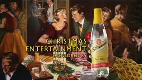
Bit of a lengthy title for this blog post which is detailing all about the effectiveness and non effective elements of a Schweppes bottle featuring the logo of their summer rewind promotion. Now just based off the previous advertising campaigns Schweppes has always tried to adopt a refined mature sense of imagery with their products. This has often resulted in retro designs ranging from the kind of graphics you would expect to see in the late fifties as the following image can attest towards.


This retro style and aesthetic has been carried out to different degrees ranging from the bottles themselves to the graphics printed on the labels.

Schweppes has also taken on the motif of bubbles and has it ingrained into the physical bottle of all of their plastic bottles while glass bottles feature the bubbles motif as part of their graphic, interestingly enough the graphic is reversed on plastic bottles, where the bubbles have been integrated into the bottle but the graphic on the labels feature glass bottles as prominent pieces of art.

An image of the bubbles motif Schweppes uses in the design of their plastic bottle

When it comes to colours Schweppes find themselves in a position where their free to use a wide range of deep colours though their range, and each colour has been matched appropriately to the flavour.


So while this is all well and good how does the current bottle I have in my hands compare with a mainstream market, weighing in it's pros and cons? Well for starters an a few images to give an idea of the product. (I don't have a camera available at the moment)

This is the bottle that I have in my hands -


And this is the logo that they've added along the top of the label of the bottle with a blue colouring scheme that is featured across the entire range of Schweppes products from lemonade to Pepsi, to solo, to mountain dew, etc.


The particular gimmick of this promotion is that when you collect enough points from drinking Schweppes products, you can send away your codes and points and get a shirt, which is a simple enough gimmick although it does lack a bit of the grand prize feel of a lot of other promotional offers however there isn't an element of chance to this promotion aside from their total stock.

Breaking down the design of this bottle and it's corresponding label yields a mixed bag of pros and cons.

Pros:

1. The blue and orange stick out to an extent that the gimmick stands out amongst the other bottles that its next to on the shelf.

2. There is no chance with the gimmick so if you buy the product a certain amount of times you will get the item you desire, if you do indeed desire the item in question.

3. The bottle itself is well designed, recyclable and suitable for mass production and consumption in a way that is favourable to a super markets way of stacking product.

4. The print across the bottle harkens back to the older days of glass bottles and helps to re-iterate the retro feel that Schweppes endorses.

Cons

1. The retro look of the glass printing gets cut off abruptly at the bottom of the bottle.

2. The gimmick doesn't have the same sense of reward as other competitions with a big pay out.

3. It harkens back to two different time periods with the gimmick of the faded shirts being a fashion from the eighties while the bottle aesthetic has roots in the fifties.

4. The scratching aesthetic that they've added to the logo gives it a degraded look that once again seems at odds with the graphics normally associated with the brand.

 Whether or not there are more pros and cons for this design could be debated, as this particular design has gone through several iterations to where it is now, but this current design does have its issues. But can anything ever really have a perfect design? Perhaps we'll find out later, perhaps not, either way it'll be interesting to see what comes of this in future iterations of the ideas Schweppes has carried throughout the years.

~ Fin


Wednesday, February 16, 2011

Basic photoshopping Exercise: They Cannot be Stopped!


This is the image done for David's photo manipulation class, in which we had to go through the basic tools while mucking around with the stock standard photos that ship with Windows 7. Seeing the penguin photo I immediately knew what I wanted to do and it was just a matter of going through the right steps with the right tools.

First thing I did was grab the background image, which was the desert image, and separated it into two sections using a mix of the magnetic lasso tool and the polygonal lasso tool to get the selection as close to the mountain range as possible. I then separated the two elements onto different layers and began work on adjusting the hue, saturation and colour balance until I found the right combination I was after.

Finally I added a gradient to the to the sky part of the image, that was a mix between deep red and a red with a drastically reduced opacity to give the horizon line a red tinge.

To add the penguins I selected one of the penguins, once again using a mix of lasso tools to get the best possible selection I could get, and then cut and copied the penguin across to the desert image The penguin was then duplicated again into a second row and then the edges were touched up with the blur tool to remove the hard edging that follows most cuts without feathering. These two penguins were then duplicated until the entire bottom row was covered with penguins.

For the final penguin I used the same selection method of the penguins to cut it out of the image and into the desert image where i used the free transform tool to re size him to an appropriate height, and then created another layer nestled between the cliff face and the sky. A paint brush and a healing brush was used to add a red tinge to the penguins yellow coat.

The texting tool was used to create the text (Shocking I know) and then was edited with the transform tools to create the upwards arc. Finally once all the elements were put in place the image was flattened and then saved out as a jpg file where it now hangs at the top of this post.

Hurray for basic photo shopping skills.

Monday, February 14, 2011

OH&S Chronicles: Oh McCain, you've done it again!

So for the homework task for last week's OH&S class we were instructed to find an issue and report it here on the blog, and well I've found two that are of particular interest. The first being an accident that occurred at the McCain food factory at Ballarat, and the second being a construction site accident that ended up with a man having six bolts enter his skull. These tales of woe and misfortune are as follows.

McCain Incident

MCCAIN Foods is facing a hefty fine after a maintenance fitter lost his thumb in a machine three years ago.
The County Court at Ballarat was yesterday told that the Ballarat food manufacturing company failed to provide training to the victim, whose right hand thumb was amputated after the workplace accident on February 21, 2007.
Crown prosecutor Justin Lewis said the victim and an electrician attended a broken down potato washing machine at 4am to repair it.
He said the victim put his hand in the machine and it suddenly started operating due to an electrical overload, causing his hand to get caught in a chain and sprocket.
"The accused production supervisor thought he had been trained in the lock-out procedure but he was not,'' Mr Lewis said.
The court was told that the same machine, which was old and regularly required maintenance, had a mechanical problem earlier that day and its side guards were replaced.
"There were some isolation procedures (in place). The machine was tagged and isolated earlier in the day. The difficulty was that while this procedure was undertaken earlier in the day, (the victim) had not received any training for it," Mr Lewis said.
McCain Foods pleaded guilty to two counts of failing to provide and maintain a safe working environment.
The prosecution said the maximum penalty for the offence was $966,870, but submitted that a fine ranging between $70,000 and $90,000 on each charge would be appropriate.
Mr Lewis said the company had prior convictions, which the prosecution regarded as serious.
Defence barrister Robert Taylor argued that the fines should be on an aggregate basis and at the lower end of the scale.
He said McCain Foods had made safety improvements to the machine since the incident and there were substantial training commitments at the company, with $5.9 million spent on health and safety over the past three years.
He said a supervision system was put in place in 2006 and, since 2007, the company closed one day a year for a safety training program for its employees.
Mr Taylor said the victim received training before he returned to full-time work four months after the incident.
McCain Food's national financial director and resource manager, a production manager and occupational health and safety representative attended yesterday's plea hearing before Judge Duncan Allen.

Now this is clear cut as an OH&S issue report can be with findings going back to the root cause of the accident, lack of training and proper awareness procedures enforced which resulted in the loss of a workers thumb. The coverage of the next report is not so clean cut.


If only they had OH&S nailed down


A construction worker had six nails driven into his head in an accident with a high-powered nail gun, but doctors said Wednesday they expect him to make a full recovery.

Isidro Mejia made his first public appearance Wednesday since the April 19 accident that left him with nails embedded in his face, neck and skull. He told reporters in Spanish from his wheelchair that he does not remember much about the accident, but is grateful to be alive.

"He says that he's very happy to be alive," said Dr. Rafael Quinonez, a neurosurgeon who removed the nails at Providence Holy Cross Medical Center. "And he told me this morning that he thought he was going to die. He was happy when he opened his eyes, and he saw that he's still with us."

Mejia, 39, was building a home when he fell from the roof onto a co-worker who was using the nail gun on the second floor, Los Angeles County sheriff's Deputy Mark Newlands said.

The two men tried to grab each to keep from falling, but both tumbled to the ground. At some point, the nail gun discharged and drove the nails into Mejia's head.

"They're extremely powerful," Newlands said. "They've got to drive through three-quarter-inch (two centimeter) plywood."

Three nails penetrated Mejia's brain, and one entered his spine below the base of his skull. Doctors said the nails barely missed his brain stem and spinal cord, preventing paralysis or death.

"We did not have too much hope that he would survive, but we did it and he survived," Quinonez said.

Five nails were removed the same day and the sixth, in Mejia's face, was removed April 23 after swelling went down, the hospital said.

Doctors expect him to fully recover after undergoing rehabilitation therapy.

Authorities cleared the co-worker of any wrongdoing.


The underlying OH&S issues with this incident are a little harder to pin down to the direction the report took in which the co-worker firing the nail gun into the mans head is the primary focus of the news story, but before that this whole chain started because of one minor incident in comparison. The simple act of falling off the roof led to this series of unfortunate incidents which one has to ask what measures were put in place to prevent such an accident.

Well that's it for this *cough*last*cough* weeks OH&S report, there may be another one later in the week depending on how this week goes.

Stay safe, until next time folks

Get the Glass: A reflection

Get the milk was an interesting exercise in interactive authoritative media, even though it had it's problems it was in hind sight a positive experience, combining elements of board games, "skill" based challenges (More on the use of my quotations there later), with a little bit of general milk knowledge and puzzle solving thrown in for good measure.

Listing the positives about this game is fairly straight forward.

1. It has a fairly nice graphical style that is reminiscent of claymation and other similar stop motion disciplines.

2. It's technical use of Flash to seamlessly weave together all of the elements they've brought together is impressive.

3. Clever use of puzzles, not wanting to spoil it for others but even certain challenges that seem impossible to guess, have the answer sitting right in front of you.

4. The animation work was smooth and I didn't notice any frame skipping.

5. It gets the balance right on the frustration/reward for the board game elements, balancing lives, luck and knowledge.

The Negative things on the other hand.

1. The steering controls on the first challenge left something to be desired.

2. Touching on the challenges again the time constraints were definitely on the very fine tuned edge of being a bit too harsh.

3. There are certain knowledge questions about milk that are asked that were actually asking questions about local states in America that sort of made it a game of guess work for anyone not in the know of other countries.

4. The dice can definitely be exploited and if you you know what your doing you can get high numbers all the time, although this does in a way lead onto my next point.

5. Those police are dirty rotten cheaters and don't let anyone else tell you otherwise

Effective advertisement and the non effective advertisements

Perusing over advertisements looking at what makes an ad effective and what makes an ad non effective seems to be something that's entirely up to a persons preference, after all "know your target audience" is something any ad designer would know before hand and with the target audience comes a certain set of likes and dislikes. I have seen many advertisements that did well at making themselves look approachable to someone in the market for their product but left me clueless as to what their product did or what was the point of the product.

The following three advertisements were ads that I found to be very effective in the way they catch the eye in a way that was related to the product while still leaving no question as to what your getting.

1 A fine advertisement for hats


This image is effective due to it's use of two very recognizable symbols (Those being Adolf Hitler and Charlie Chaplin if you didn't know), stripping the two people down to their facial hair and choice of head ware which draws attention to the hat. It's a very minimalistic style of ad drawing upon peoples vilification of a historic figure while using a figure that many cherish to promote their head ware.

2 Sex sells best when it isn't about Sex


This ad is effective due to it's use of lighting and product placement to instill the suggestion of an image that isn't there. This image catches the eye and makes the person either take a close look or in the case of glancing past, makes the person look again. Closer examination of the image leaves no illusion of the product while still being pleasing to the eye.

3. If it looks like a duck


A nice use associative imagery makes this ad another good contender for an effective advertisement. The vacuum cleaner is used in such a way to draw a comparison between itself and the power of a hunting rifle, while the colours ensure that the vacuum cleaner is blended in with the scenery as though it belongs there.

How not to make an effective advertisement.

1. Lack of focus equals a lack of attention

This ad suffers from being far too convoluted to be effective, they've opted for a lot of cut-aways, cutting away the face and even their own logo in an attempt to get people interested with the phrase being the hook that there's more the person doesn't know. All it leaves the viewer with is a wall of information that is more in line with an article then an advertisement leaving the viewer not really sure what it is their even selling. Facts and figures are well and good but they need to be presented in an appealing way, they can't just be dumped on the page when you have other elements pointing to them.

2. Don't show what you're selling


If you can beleive it this is an add for a pet memorial service though you would never guess it by just looking at it, it's a graph with the same dog in two different poses and reverted in some to show an increase in revenue although why anyone would think of putting that as your main drawing point for something that is suppose to sell business to a memorial service does seem to be a bit on the low side of class. This ad also suffers from the same issue as the one above it suffering from a lack of fouc that further obscures what their trying to sell.


3. Some things should never be mixed, while other things are a bit much, some manage both.


Definitely an interesting advertisement campaign, meant to highlight an infusion between two separate elements into something good, and that's where this advertisement falls flat. While this advertisement works on the weird factor that makes a person look twice if their glancing by, any time spent staring at this ad seems to cause revulsion from the creatures pose to the way he's licking his lips and the way every element on this advertisement is pointing to it's crotch.

Monday, February 7, 2011

This is the First

But surely not the last, I mean how can it be the last when there is still so much to do with so little time, this piece of reality is small now, but with the right poking and prodding it will grow into something a bit more sensible in all the chaos of ones mind.

Well as sensible as an egg yolk floating in a pool of chicken offal in any case, which brings us to the next post...