It's been a week since the class critique of all our ideas and since then I have written down some improvements to both the idea and the pitch itself to help give it a more eye catching and lasting appeal that will hopefully hold up as a finished product. We were tasked to take what we learnt from the critique, write up a list of improvements and then do a quick sketch to present to our control group.
These are the list of improvements starting with the idea itself.
Improvements to the idea:
1. Needs to be simplified, in its current implementation it is two separate parts as well as the syrup which is sold separately which raised concerns over its complexity and price. Current train of thought is to make it just one item and then the syrup is added, while still retaining the twist and shake to get the custom flavours out into the bottle. This also addresses another concern raised in the idea of the rocker bottom piercing the bottom of the rocker top as the sharp end could be used as a weapon, but if it's all one item people can't get to the sharp piercing part of the bottle without tearing it apart which is just as dangerous as a person cutting into a regular P.E.T.E bottle.
2. A better way of incorporating the cooling element to the bottle, such as a form of gel that would already come with the bottle so people would only have to get the syrup they want and insert it into the bottle. This would also increase the viability of over the counter sales as it's extra cooling can be a selling point from any location.
Some ideas to improve the pitch, due to my limited analogue skills this is going to be a big one:
1. The colours need to be more vibrant and eye catching, which is even visible in the photo as the colours don't really show that well and you need to look really closely to the image to see anything substantial. Current thought train is to have light colour towards the centre of the design that grow in intensity as they reach out to the edge of the page.
2. Needs to include more information on the product including greater coverage of the cooling facts as well as the advantages that brings.
3. Overall presentation needs to be clearer, and more coherent. The four quadrants put the information all over the page with a very loose structure of focus.
4. The main bottle could be implemented into the image with a bit more coherency, as it stands the bottle is just dumped on the page and conflicts with the four quadrant symbol. It could still catch the eye if it was a major part of design but it was worked into the other elements.
5. Title could be cleaner with typography that would be associated with the product and the company making it, (In this case Schweppes). If current idea of making one bottle goes through the control team could simplify the name down to something akin to just "Rockers".
Getting these improvements into a quick sketch is the challenge I am presented with now, more developements as they occur.
Monday, March 28, 2011
The Analogue Pitch: Schweppes Rocker Bottles
Here is the photo of the analogue pitch submitted for an assessment regarding critical thinking and idea development, more to come later on in the day regharding issues and improvements as well as control group updates.


The analogue pitch
Monday, March 21, 2011
Other idea's that came before the bottle: Fried Noodles
WEell today is the day that our first assessment for Luke's Design and critical thinking unit of this subject and before this blog is graced by the analogue pitch of the "Rocker Bottle" design I came up with, I thought I would take the time to go over a couple of the other ideas that I came up with when it came to thinking of a product. As you already know from previous back logs of posts talking about Schweppes bottles, it was required that that sort of critical thinking was applied to a range of products.
the first product on the chopping block was a simple one:
Mi-goreng noodles
Yes, the obscure noodle snack that seems to either spread by culture or word of mouth, I hadn't even heard of the things until I came to Wagga some years ago and I was shocked that I had gone so long ignorent of this simple yet delicteble food that serves the poor admirably. However looking at the packet I can understand why this food had gone on so long without my notice and maybe you'll see why when you gaze at the following...


The sash packets, scourge of kitchen benches everywhere as they spill over in globules lumps and sticking to fingers as they make the second last voyage of there existence to the bowl. There were a number of ways to go about this but the first idea that came into my head was to completely redesign the package from the plastic sash's to the wrapping itself to a cardboard box that came complete with bottles for the individual sauces that would squirt out more controlled offerings of the sauces.
The other issue to address was the lack of noodles being visibly shown on the packet while keeping all of the suggested things visible on the package but such a task did seem slightly odious as to get an idea of how to lay it out i would have actually had to cook up a fair chunk of Mi-Goreng and then pose it for reference. It may not seem like much of a reason to drop the idea but a transition from plastic to cardboard seemed to carry just as many negatives as positives and the idea of evolving a product to make it better seemed hollow in this case.
the first product on the chopping block was a simple one:
Mi-goreng noodles
Yes, the obscure noodle snack that seems to either spread by culture or word of mouth, I hadn't even heard of the things until I came to Wagga some years ago and I was shocked that I had gone so long ignorent of this simple yet delicteble food that serves the poor admirably. However looking at the packet I can understand why this food had gone on so long without my notice and maybe you'll see why when you gaze at the following...
To me this doesn't exactly market the taste of Mi-goreng well and conveys more of the food suggested you add to the noodles to enhance the flavour, the most glaring example being that of the egg that takes centre stage on the packet and looking closely at the other vegetables and odd bits added to the dish it's very hard to see any noodles at all, in fact I daresay that without the "Fried noodle" label on it I would easily mistake this for some sort of Asian meal in a packet (Which has all the charm of a sandwich from a petrol station vending machine). It has to be said though that the colour scheme of their logo works well with a good mix of warm colours and the packaging wasn't the orginal reason I choose to take a look at Mi-groreng noodles. It was these:
The sash packets, scourge of kitchen benches everywhere as they spill over in globules lumps and sticking to fingers as they make the second last voyage of there existence to the bowl. There were a number of ways to go about this but the first idea that came into my head was to completely redesign the package from the plastic sash's to the wrapping itself to a cardboard box that came complete with bottles for the individual sauces that would squirt out more controlled offerings of the sauces.
The other issue to address was the lack of noodles being visibly shown on the packet while keeping all of the suggested things visible on the package but such a task did seem slightly odious as to get an idea of how to lay it out i would have actually had to cook up a fair chunk of Mi-Goreng and then pose it for reference. It may not seem like much of a reason to drop the idea but a transition from plastic to cardboard seemed to carry just as many negatives as positives and the idea of evolving a product to make it better seemed hollow in this case.
Wednesday, March 16, 2011
Dave's photoshop Class: Selection tools
Today in Dave's Photoshop class, the lesson was all about selection which on the surface doesn't sound like much, but in actuality selection is one of the most important things you have to master in programs like photoshop, especially if you want to create anything of actual worth when it comes to manipulating or creating images.
The exercises Dav presented us started with the basic shape of a circle and then progressed to the letter "S", a printer, a car on a highway and a girl sitting down. (That's also in order of difficulty with the circle being the easiest and the girl being the hardest, hair can be a nightmare when it comes to selection). Not only did we have to cut out these objects and paste them on a black background which highlights the irregular shape defects caused by the selection tools but we also had to use the pen tool. A vector based tool that creates curves between points based on anchor points and takes a fair amount of fiddling to get right, even for seasoned pen tool users.
The following image is the black background with the objects unceremoniously pasted onto the surface to show our accuracy with the pen tool.

Selecting with the pen
The next task was to create an image where objects were pasted into the scene and made to look as though they were part of the original photo, for this a highway picture was given and the car was duplicated and enlarged slightly to account for the distance in space and then the edges were blurred to help get rid of the stick out effect that objects get when you place them in another scene. A plane was then finely cut from another photo and placed into the shot with the luminosity lowered to wash out the strong colours it came with originally. The edges were once again blurred so it doesn't appear as a copy/paste job.

I'm seeing double
That wraps it up for today's photoshop class, stay tuned as updates to the Schweppes advertisement progress are posted later in the week.
Wednesday, March 9, 2011
Drawing Dave's Photoshop class: Badgers and Bombs (Abstract layer work)
For today's photoshop escapes it was our task to take a bunch of images and then arrange them in such a manner as to be unrecognisable next to the original images. Our first job was to use the images supplied by Dave featuring the moon, Einstein, a nuclear detonation, and an x-ray of a hand. Since I'm not really a fan of abstract art this was mostly me winging it in terms of lay out and composition, trying to find a balance between something good to look at while keeping a central focus. For me this was the eye of Einstein which despite the numerous replications I kept the eye on top of itself and the multiple eyes actually did a good job of enlarging the eye.
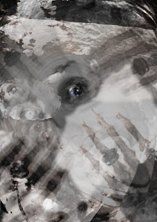

We are all sons of bitches
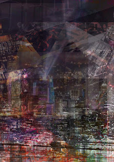
After the first image we were sent to retrieve images of our own so naturally I went straight for pictures of honey badgers and city scape's with an aim of creating a Godzilla like image although the honey badgers get lost in the layers of cities and pictures of stone angels.

Badgers in the City
That was all I managed in the three hour time slot although I can see how people can use these abstract art pieces to convey things, I'm just not sure it's for me.
Wednesday, March 2, 2011
Dave's Photoshop class: Dolly* tool
For this Wednesdays class the main focus was on the cloning tool with a few exercises covering its application across a number of images. For the first few exercises it consists mostly of fixing up images removing the scratches or in the case of the lake photo removing a garish red dash from the centre of the portrait. The others were outright modifications changing door signs while completely removing elements of other images.
This is the photo of the computer case with before and after showing the removal of the scratches which wasn't as straight forward as it seemed with a number of scratches covering different shadowy areas that could easily escape attention unless your paying very close attention to the image.
Before:

After:

The next photo had a lot of work going into the finer details as the red gash ran right across a lot of high detail objects so it required going into the image at a high zoom and touching out all of the red while ensuring that hard lines of the various objects continued naturally without any jarring edges or weird colour variations.
Before:

After:

The next image was of a door where an unfortunate sign was accosted with the worst font in history and is recovering in intensive care after a mace was used to remove the offending text.
Before:

After:

I have it on good authority that the door will make a full recovery although whether this is the last we've seen of the offending text remains to be seen as investigators on the scene only found traces of the bad. More exciting updates as the story progresses.
This is the photo of the computer case with before and after showing the removal of the scratches which wasn't as straight forward as it seemed with a number of scratches covering different shadowy areas that could easily escape attention unless your paying very close attention to the image.
Before:

After:

The next photo had a lot of work going into the finer details as the red gash ran right across a lot of high detail objects so it required going into the image at a high zoom and touching out all of the red while ensuring that hard lines of the various objects continued naturally without any jarring edges or weird colour variations.
Before:

After:

The next image was of a door where an unfortunate sign was accosted with the worst font in history and is recovering in intensive care after a mace was used to remove the offending text.
Before:

After:

(*It's like Dolly, get it?....You know... Dolly the sheep, with the cloning and... actually you know what? Forget it! Your no fun anyways. )
Subscribe to:
Posts (Atom)